BACKGROUND
"Arsenal Hospitality Experience" is a Delivery project created by XDC. In this project my role was conducting the benchmark research, creating the UI Concept, and designing a new hospitality experience system for Arsenal FC
At First, Benchmark Research was made, and according to its Conclusions, the UX Principles were formulated. In the 2nd phase, my role was to create the UI concept, according to Wireframes we got from the client.
During the concept phase of the project, our team included a Manager, a design lead, and myself, and During the detailed design phase, 3 more designers joined the team to create all the Needed screens and flows.
STEP 1: BENCHMARK RESEARCH
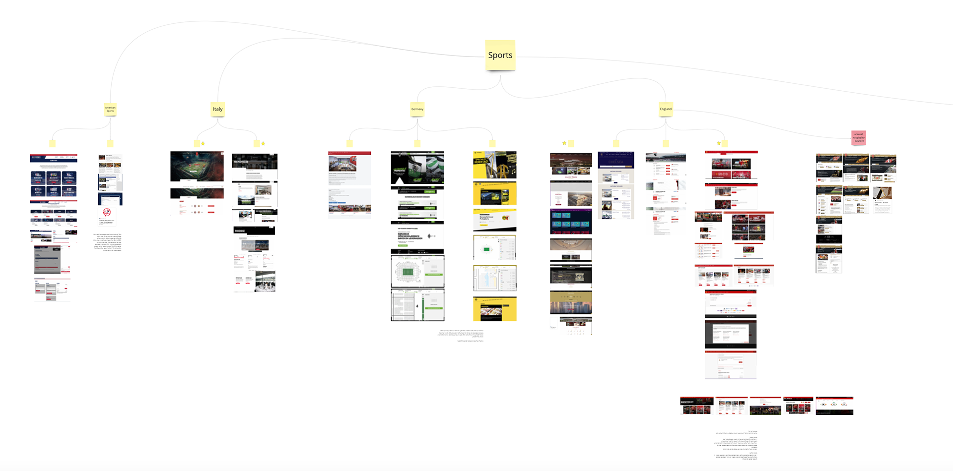
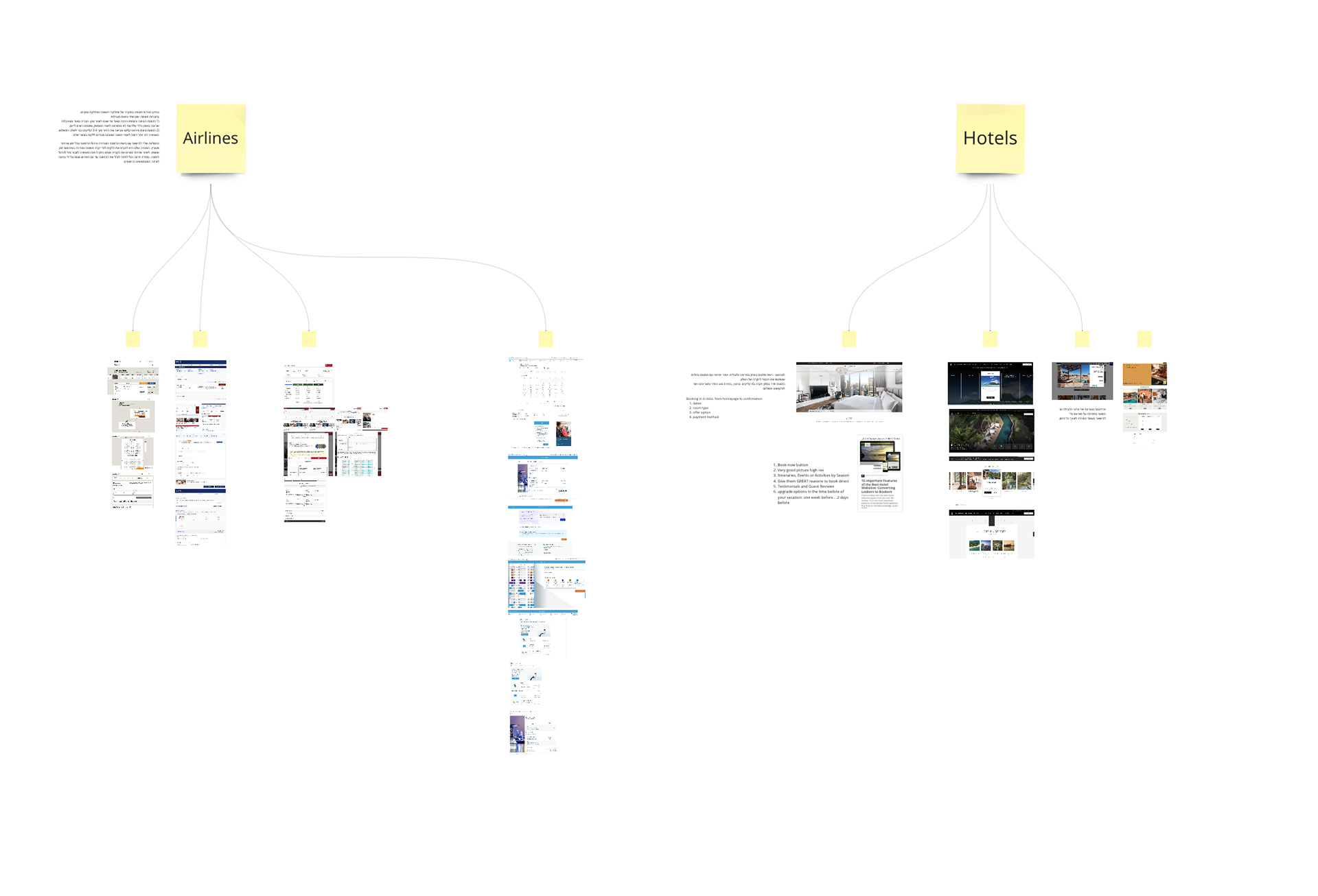
The market research phase was focused on 3 industries:
1. Sports Industry: Testing and researching how such systems look and function in different areas and markets. The research was based on examples not only from England - Arsenal's direct rivals, but also from Germany, Spain, Italy, and similar systems from American sports.
2. Airlines companies: discovering how airlines solved the challenge of a premium experience, with an emphasis on the experience of buying first-class flight tickets.
3. Boutique hotels: How does the online shopping experience of a premium accommodation experience in the world's leading hotel chains look like?
From each one of those areas, we got to a conclusion sentence that gave us the UX Principles that will lead us in the whole project (cannot be showcased due to the privacy policy of the club and company)
2. PAIN POINTS
From the benchmark conclusions, We defined the pain points of the current system in order to make a whole uplift for the new design:
1. Outdated experience and design of the existing portal (pictures from the old design attached)
2. The overall look & Feel of the existing portal does not convey enough of the "High-End" and premium standard, which is the target audience.
3. Alignment with Club system: Premium service purchases should be aligned and linked with the existing club third-party ticketing system.
4. Inability to Support multiple purchases.
3. CONCEPT PHASE
The Concept presentation to the client included designs of the Homepage and 2 internal screens followed by the client WF and some more refinements made by our team.
On the homepage, we created a design aimed to give the user attention to the visuals. we used a floating navigation bar paradigm, inspired by references from boutique hotels experiences studied in the benchmark phase.
The photos inserted to the home page aimed to focus on the luxurious lounges at the Emirates Stadium.
The UX goal of the home page was to give the user the ability to choose an experience according to a specific game or according to the lounge of their choice - another decision resulted from the benchmark research.
additional internal page presented the catalog of the stadium's lounges.
additional internal page presented the catalog of the stadium's lounges.
4. DETAILED DESIGN
At this phase, 3 more designers joined the project, and in a short time about 15 screens were designed for desktop and mobile format.
At the end of this phase, we got access to Arsenal's design system, and all the designs aligned with those of the club's website.
Due to development limitations, the floating navigation bar from the concept was withdrawn, but it remained part of the core product our client got.
5. THE FINAL PRODUCT
In June 2024, almost 18 months after the design was completed, the site went live for the launch of the 2024/2025 season
and you can visit with the following link: https://hospitality.arsenal.com
